Context
A rebrand outgrew the app
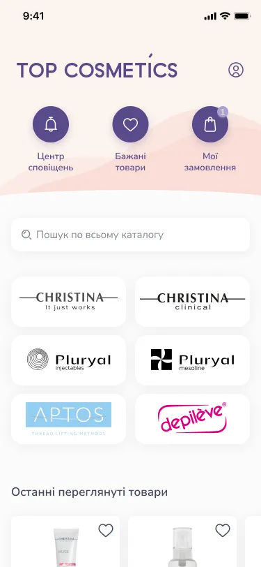
For its 20th anniversary the company rebranded. The app had to follow, and the old one no longer covered what the business needed.
TOP Cosmetics sells professional cosmetology products. Its app is a working tool for cosmetologists, dermatologists, aesthetic medicine specialists and doctors who do thread lifting: they use it to find products, place orders and follow the company’s training events.
There were also a few user complaints about inconvenient functionality. So this was not a reskin: version 2.0 was designed and built from scratch.
My role
One designer, from first directions to device testing
I worked with a PM, three developers and a writer, as the only designer on the project.
- Visual styleA new look for the app, based on the new brand
- RedesignEvery flow in the app, from sign-up to checkout
- Feature logicWorked out new features and presented them to the team
- GroomingWent through ideas with the engineers before development
- Device testingTested the product on real devices
- Talks with managers
- Talks with cosmetologists
- Competitor analysis
- Usability tests
Visual direction
Three visual directions, one chosen
I did not start with screens. I started with three versions of the redesign.
I presented all three to the team. One was chosen, and we moved forward with it: it became the base for every flow in the app.
Catalog and search · my idea
A catalog you can narrow down fast
The improved catalog was my idea. Before proposing it I studied how different services handle catalogs, filtering and search, and took the best solutions as a reference.
- Two ways inThe catalog opens by category or by brand, on the home screen and in the catalog itself
- Flexible filtersA product list can be narrowed by category and by product line
- Search as you typeMatching products first, then their categories with the number of matches in each
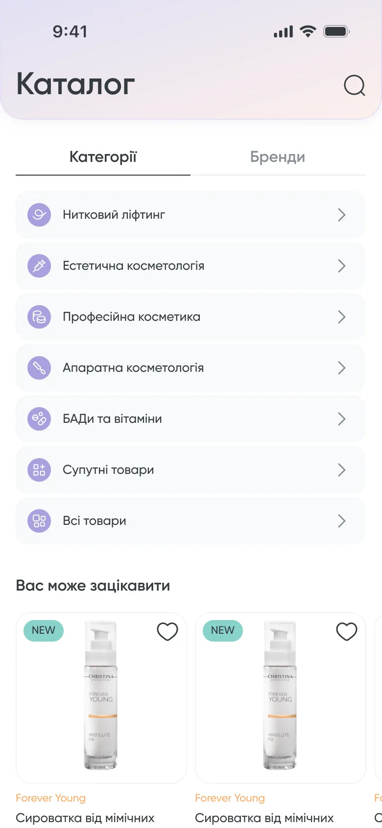 Categories or brands
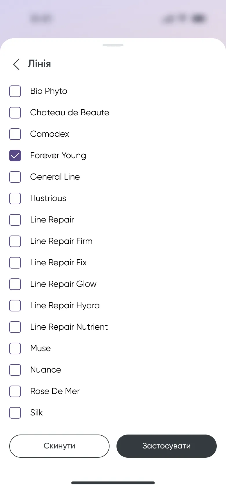 Filter by product line
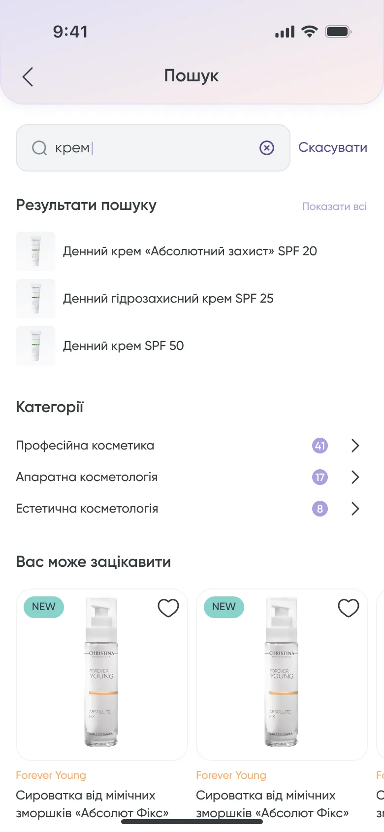 Search with category counts
The product page was reworked too. Alongside the price it shows the recommended retail price, the number of applications in a pack and the cost of one application, plus availability, payment in instalments and delivery time.
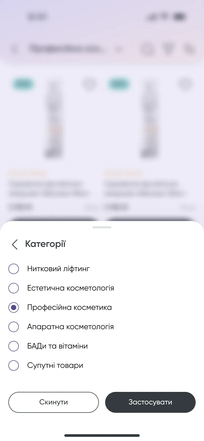 Filters open over the list
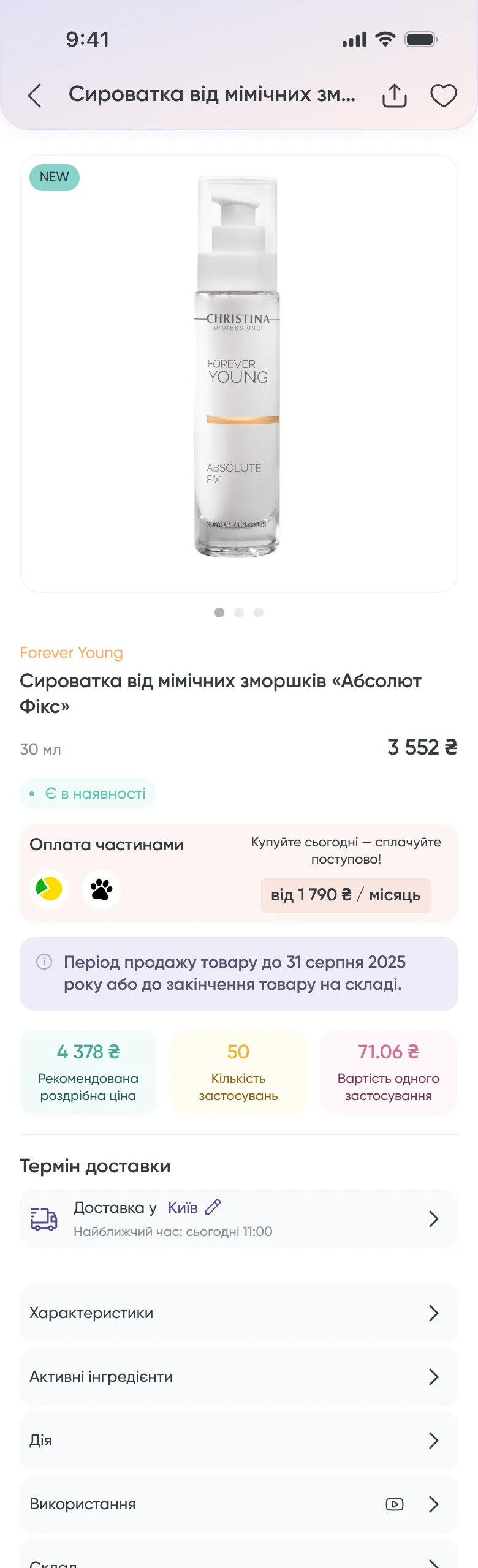 Product page
Loyalty · new in 2.0 · my proposal
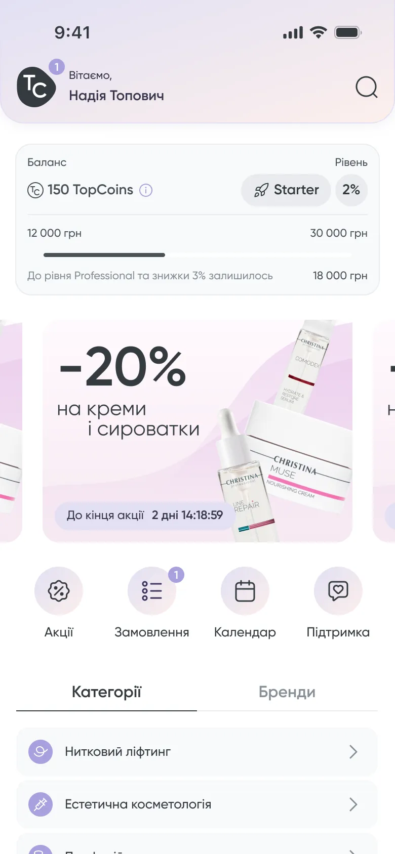
A loyalty programme you can read at a glance
How the programme looks and what the levels are called was my proposal, which I presented to the team.
- Starter
- Professional
- Expert
- Elite
The card answers three questions without a tap: how many TopCoins I have, what my level and discount are, and how much is left to the next level.
It sits at the top of the home screen and in the profile, so the next step is always in sight.
Starter, on the home screen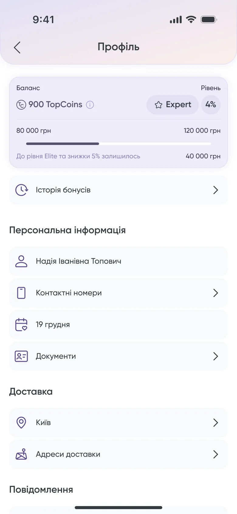 Expert, in the profile
Calendar · new in 2.0
Event sign-up moved from a phone call into the app
TOP Cosmetics runs seminars and training for specialists. I researched how other products handle event calendars, proposed a solution and presented it to the team.
To sign up for an event, you called a manager.
You open the event and send an application from the app.
The calendar has all events, a My events tab and a tab for favourites. Each card shows the date, city, speaker and status. The event page ends with one button: send an application.
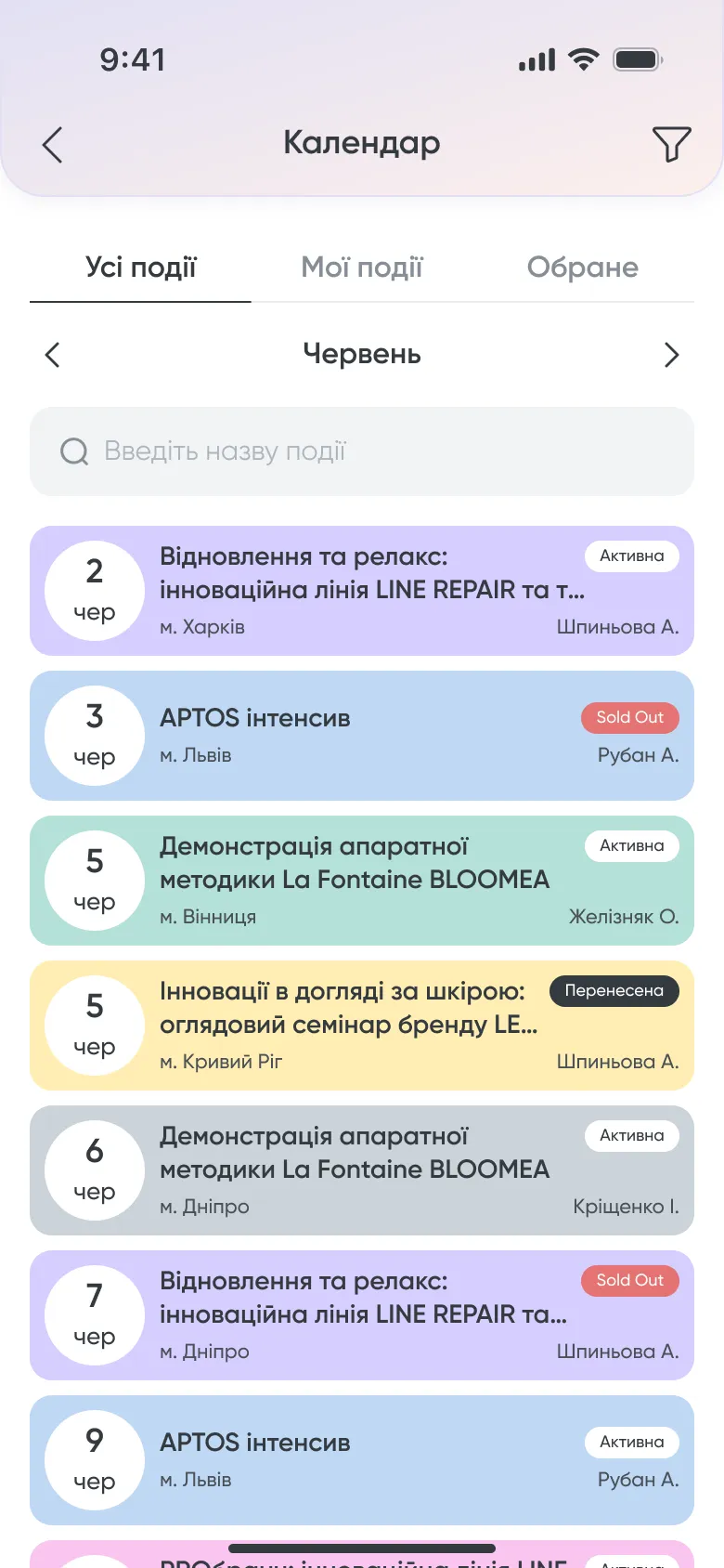 Calendar with statuses
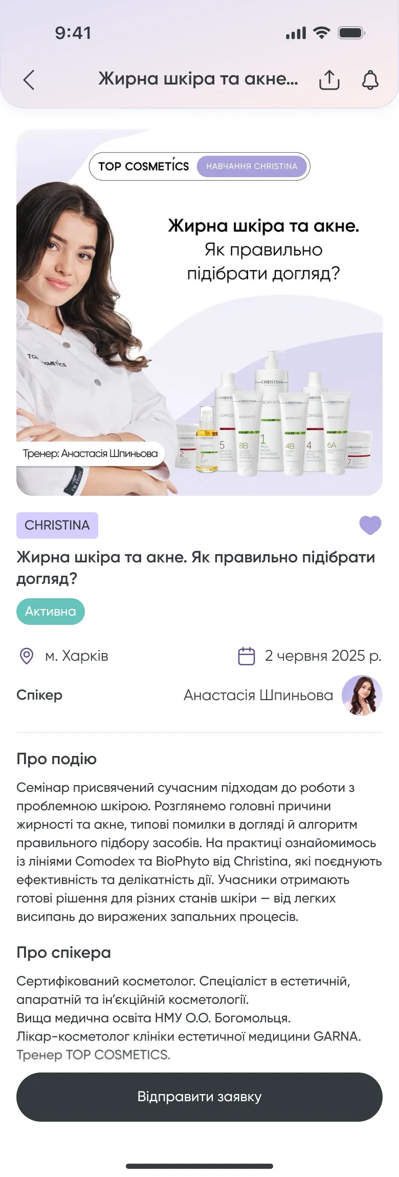 Apply from the event page
Onboarding
A guided tour for a rebuilt app
To introduce the new functionality, 2.0 has an interactive onboarding: a tour of seven short steps on top of the real home screen, each pointing at one part of the app.
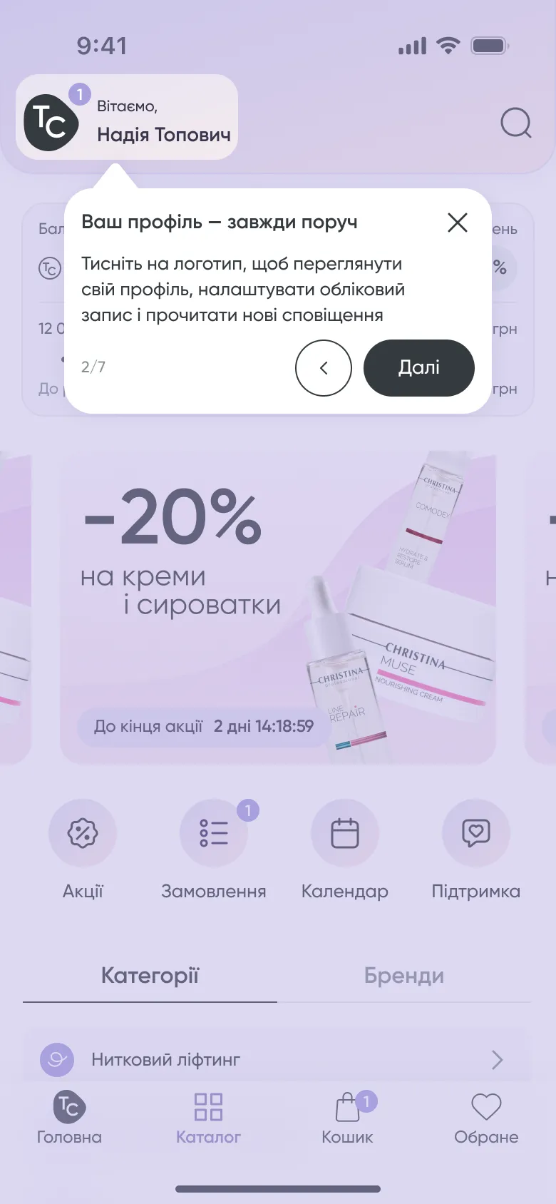 Step 2 of 7
The checkout flow and the promotions flow were improved in the same release.
Result
Released on both platforms
TOP Cosmetics 2.0 is live in the App Store and on Google Play.
I do not have product metrics to share for this project. What I can point to is what shipped:
- New visual languageFor a company with 20 years of history
- CatalogBrowse by brand or category, filter by product line
- SearchResults and matching categories while you type
- Loyalty programmeFour levels, balance and progress on the home screen
- Event calendarSign-up without a phone call
- Interactive onboardingA seven-step tour of the new app